She had been doing the work for 27 years.
Coaching leaders, facilitating change, building the kind of trust with clients that only comes from showing up consistently over a long period of time. A leadership coach based out of Pune, she had shaped careers, guided organisations through difficult transitions, and earned a reputation that sustained her almost entirely through word of mouth.
The problem was that none of it existed anywhere people could see it.
There was no website. No consolidated body of work. No single place where someone who had heard about her could go to understand who she was, what she did, and whether she was the right person for what they needed. Twenty-seven years of practice, and nothing concrete to show for it.
When she came to The Marketing Mingle, the brief sounded straightforward: build something that showcases what I have built.
What became clear very quickly was that before anything could be built, some fundamental questions needed answers.

The Work That Happens Before the Work
The first few sessions had nothing to do with websites, colours, or content. They were uncomfortable by design.
Who do you serve, and who do you not? What are the aspects of your practice where compromise is completely off the table? Which services are outside your scope entirely, regardless of the request?
These are not easy questions for someone who has been doing their work for nearly three decades. The instinct, after that much experience, is to say yes to most things, because you genuinely can help with most things. But a brand that tries to serve everyone ends up speaking to no one clearly.
The sessions pushed hard on these boundaries. And after a few days of honest, sometimes uncomfortable reflection, the answers started to come into focus. Not just for us, but for her. The clarity she needed to build anything external turned out to be clarity she needed internally first.
Once it arrived, the direction became obvious.
The Website Before Everything Else
One of the clearest decisions to come out of the early work was the order of operations. Before flyers. Before brochures. Before any printed collateral or social content. The website had to come first.
Not because a website is more important than other materials in isolation, but because it would function as the foundation for everything else. It would be her most important salesperson, available at any hour, capable of representing her to someone who had never met her, and consistent in a way that word of mouth alone could never be.
With that decision made, the structural work began.
Building Something That Was Entirely Her
The visual direction was set not by trends or templates, but by a specific question: what colours reflect how people actually perceive her, both as a professional and as a person?
The answer came from the people around her. The palette was chosen based on how she was described by those who knew her well, the warmth, the authority, the groundedness. The colours had to carry that.
While working through the structure of the site, another important decision emerged. Her services were not presented as a flat list. They were bucketed and prioritised deliberately, based on where she wanted to take her practice over the next several years. The site was not just a record of what she had done. It was a signal of where she was going.
As the content came together, new things surfaced. Details and framings that had not been part of the original brief, but that, once articulated, made the representation of her work significantly sharper. That is the nature of good content work: the writing reveals things the brief did not anticipate. Her presence throughout this process was what made it possible. Every draft was sharpened through her feedback.
The Decision That Changed the Outcome
At a certain point in the project, something became obvious that perhaps should have been obvious earlier.
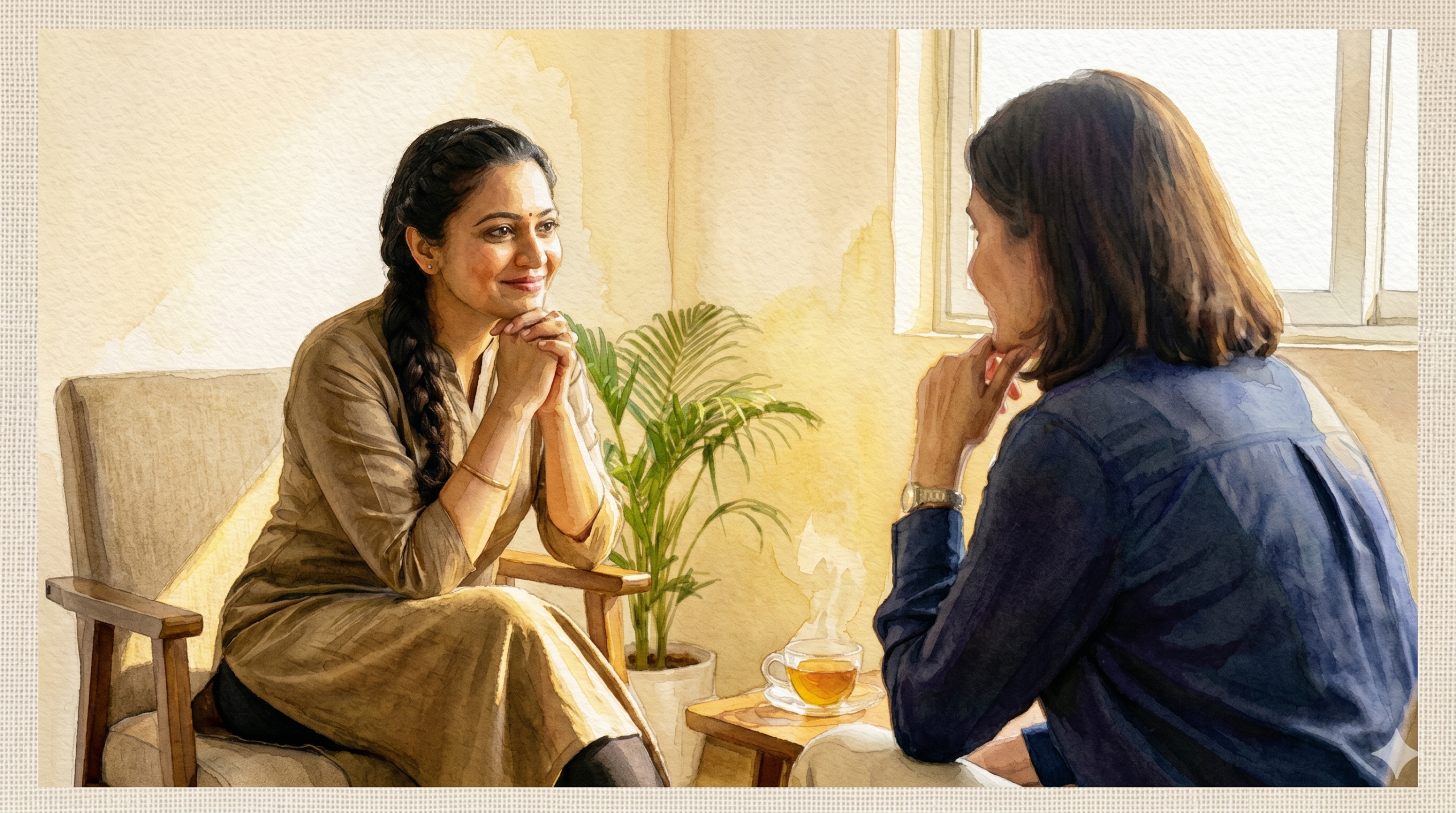
This was her website. She was the brand. And the site should reflect that completely, not through stock photography of people who looked vaguely like the audience she served, but through images of her, in environments that felt true to who she is.
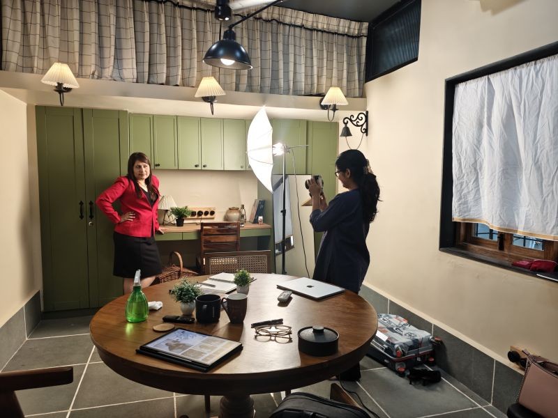
A photoshoot was booked. And in keeping with The Marketing Mingle’s approach to using every available tool intelligently, AI was used to determine which colours and poses would work best within the site’s visual language. The session was prepared for, not improvised.
The resulting images did what stock photography never could. They put the real person at the centre of every page.
")
What Happened When It Launched
When the website went live, the response was immediate and consistent.
Friends, family, colleagues, professional connections, people she had not spoken to in years: the feedback came from every direction. The site was described, again and again, as exactly how people know her. Some said they felt like she was speaking to them directly through the site. That it captured not just what she does, but how she does it, and who she is while doing it.
People said the website felt like Moumita was speaking through it.
That is the outcome of a process that starts with clarity rather than execution. The website was not built on top of an unclear position and then refined until it looked right. It was built on top of 27 years of real experience, made coherent through deliberate strategic work, and expressed through visuals and words that were entirely specific to her.
There was no guesswork. No borrowed aesthetics. No generic language. Everything on the site belonged to her, because everything that produced it started with her.
The Lesson
A website is only as strong as the clarity behind it.
For a coach with 27 years of practice, the temptation is to show all of it, every domain, every type of engagement, every credential. The work here required the opposite: making hard decisions about what to lead with, what to set aside, and how to present depth without creating overwhelm.
The site that resulted from that process was not comprehensive. It was precise. And that precision is what made people feel, on first visit, that they had found exactly the right person.
Twenty-seven years of work. One website. Finally, something to show for it.
Read Similar Stories