
Some businesses build things that most people will never see, but that everyone depends on.
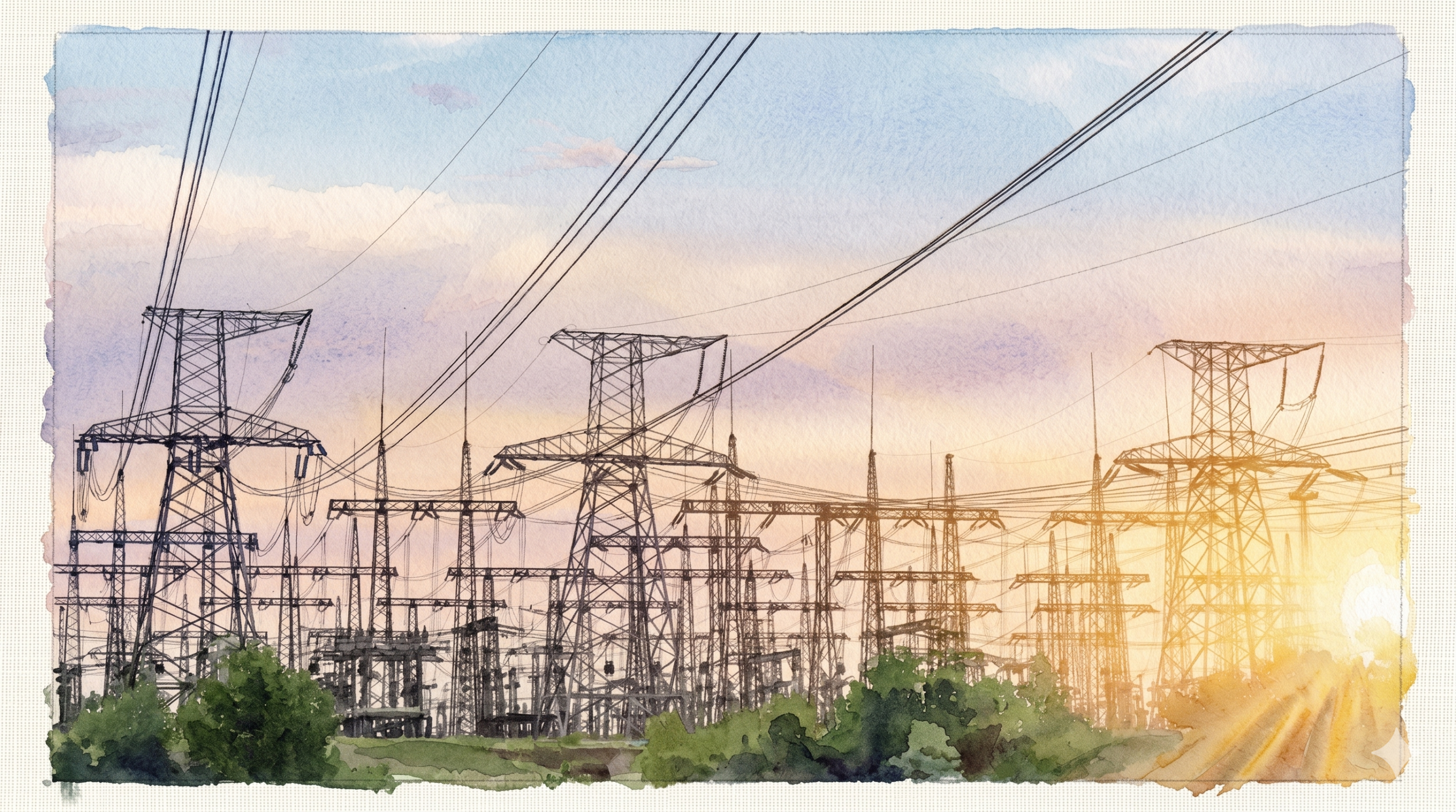
This company was one of them. A growing power distribution company operating within India’s industrial sector, they had spent years building the kind of infrastructure that keeps factories running, SEZs functioning, and industrial zones across the country supplied with the reliable, stable power they cannot operate without. Complex engineering, carefully maintained networks, and a track record of delivery in a sector where failure has consequences that ripple far beyond the site.
When they came to The Marketing Mingle, the gap between what they had built and how they were presenting it to the world was almost difficult to believe.
Their entire digital presence was a single-page website. Their logo was a lightning bolt inside a circle: functional, generic, and indistinguishable from any other company in any other industry. If you spoke to the CEO, the depth of the work was immediately apparent. If you searched for the company online, you would have no idea what you were looking at.
The ask, as it arrived, was modest: improve the website.
What the situation actually required was considerably more than that.

What the Engineers Had Built, and Why Nobody Could See It
The fundamental problem was not visual. It was representational.
This company had spent years earning a reputation within the industrial sector through the quality of their engineering and the reliability of their delivery. That reputation existed, but it existed almost entirely through direct relationship and word of mouth. Nothing in the company’s external presence communicated the scale of what had been built, the complexity of the work involved, or the significance of the clients and zones they were serving.
A company supplying stable power to industrial zones across India, fuelling manufacturing and production at national scale, had a digital presence that offered no evidence of any of it. No record of their projects. No articulation of their capabilities. No visual identity that said anything specific about who they were or what they stood for.
The amazing work they had done over the years felt bland and flat from afar. But impressive when you spoke to the CEO. The entire problem was sitting right there: the CEO was doing the work that the brand should have been doing.
A business in the growth phase, actively looking to expand its reach and win new contracts, cannot rely on the CEO carrying the story in every conversation. The brand has to do that work first. It has to open the door before the person walks through it.
The brief was expanded before any work began. This was not a website project. This was a brand-building project, and it needed to be treated as one.
Starting Where It Had to Start: The Logo
Before the website, before the collateral, before anything else, the identity needed to be right.
The existing logo was the kind of mark that comes from asking someone to produce something quickly without a strategic brief behind it. A lightning bolt in a circle. It communicated electricity, which is technically relevant. It communicated nothing else. It had no personality, no specificity, and no connection to anything distinctive about the company.
The new logo was designed to carry real meaning. The brief was not to make the logo look more modern, but to make it represent what this company actually is: a company that provides power and energy with balance, operating within complex industrial systems where stability is not a preference but a requirement.
The resulting mark was specific to them. It could not be mistaken for a generic power company because it was not built from generic power company references. It was built from a genuine understanding of what this business does and how it does it.
A logo is not decoration. For a company in the growth phase entering new conversations with new clients and partners, it is the first thing those people see. It has to carry the right message before a word is spoken.
With the identity in place, every subsequent decision had a foundation to build on.

The Website: From One Page to a Full Record
The single-page website was not just inadequate in scale. It was inadequate in structure.
A company operating at the level this one was, serving industrial clients who do substantial due diligence before signing contracts, needs a digital presence that can stand up to scrutiny. Prospective clients, partners, and institutions looking to understand the company would land on a single page with minimal information and no sense of the depth of the operation behind it. That gap between what the company was and what the website communicated was costing them before any conversation had even begun.
The new website was built as a complete record of the company. Multiple pages with categorised content covering the full scope of the business. Public information that established credibility and context. Social proof: the clients served, the zones covered, the scale of the infrastructure built and maintained. A record of achievements presented in a way that was specific enough to be believed and comprehensive enough to be impressive.
Every section was designed with one question in mind: what does a prospective industrial client need to see in order to move from first impression to serious conversation? The answer to that question determined the structure, the content, and the depth of every page.
The website stopped being a placeholder and became the company’s most effective business development tool, available at any hour, to any prospective client anywhere in the country.
Two Decks. Two Jobs. One Standard.
With the identity and the website in place, the next layer of the brand needed attention: the materials that go into a room.
Two pitch decks were rebuilt from the ground up. They had different purposes, different audiences, and different jobs within the business development process. Both were reconceived to follow the new brand identity and visual guidelines consistently. Both were restructured to ensure the slides supported the presenter rather than competed with them.
This is a distinction that matters more than most people appreciate. A deck that tries to say everything on its slides produces presenters who read from the screen and rooms that disengage. A deck built to put the focus on the person speaking, using visuals to reinforce and contextualise rather than to replace the conversation, produces something entirely different. It produces a presentation that feels authoritative rather than recited.
Both decks were built to put the focus on the presenter, not the slides. The person in the room should be the most compelling thing in it. The deck should make that easier, not harder.
The result was two presentations that could be carried with confidence into serious commercial conversations with industrial clients and institutional partners.

Completing the System
A brand does not live only on a website or in a pitch deck. It lives in every touchpoint where the company appears, and the cumulative effect of those touchpoints is what determines whether a brand feels coherent and established or patchwork and unfinished.
The visiting cards were redesigned. Not because visiting cards are a strategic priority in isolation, but because a visiting card handed to a prospective client at the end of a meeting is the last impression of the company that person takes with them. It should carry the same standard as everything else.
The letterhead was redesigned. The branded T-shirt designs were created for the team. Functional, specific, and consistent with everything else that had been built.
And then, the piece that makes everything sustainable: a full brand guidelines document. A comprehensive foundation that set out exactly what the brand looks like, how it sounds, and how it behaves across every context where it appears. Typography, colour, logo usage, tone, spatial rules. Everything that the team, and any future agency or designer working with the company, would need to maintain the standard that had been established.
What started as a request to improve a website culminated in a concentrated and well-thought-out effort to build a brand that did not just feel like another power company.
The brand guidelines document is the piece most clients underestimate until they have one. Without it, a brand that has been built carefully can drift within months as different people make different decisions in the absence of shared rules. With it, the work compounds over time rather than diluting.
What Followed
The effect of a coherent brand presence in a sector like industrial power infrastructure is difficult to overstate.
This is a sector where credibility is everything. The clients are large, the contracts are significant, and the due diligence before any engagement is thorough. A company that cannot present itself clearly and professionally at every touchpoint raises questions before the conversation about capability has even started.
When every touchpoint: the website, the decks, the visiting card, the letterhead, the team’s appearance, carried the same standard and the same visual language, the company became instantly recognisable within the industrial sector. Not because they had run a campaign or placed advertising. Simply because everywhere they appeared, they looked like a company that knew exactly who they were.
The result was multiple new contracts. New conversations that opened because the brand communicated the credibility that the engineering had already earned. The work had always been there. Now the world could see it.
THE LESSON
Engineers build systems that hold things together. They are, by professional inclination, focused on what works rather than on how it is perceived.
That focus is exactly what makes them exceptional at their work. It is also exactly what leaves the brand behind. The capability gets built. The story does not.
This company had spent years building infrastructure that powered industrial India. The expertise was real, the track record was real, and the depth of the operation was genuinely impressive to anyone who understood it. What was missing was a brand that communicated all of that to people who had not yet spoken to the CEO.
When expertise meets storytelling and branding, growth follows. Not because the work has changed, but because the right people can finally see it.
Read Similar Stories