
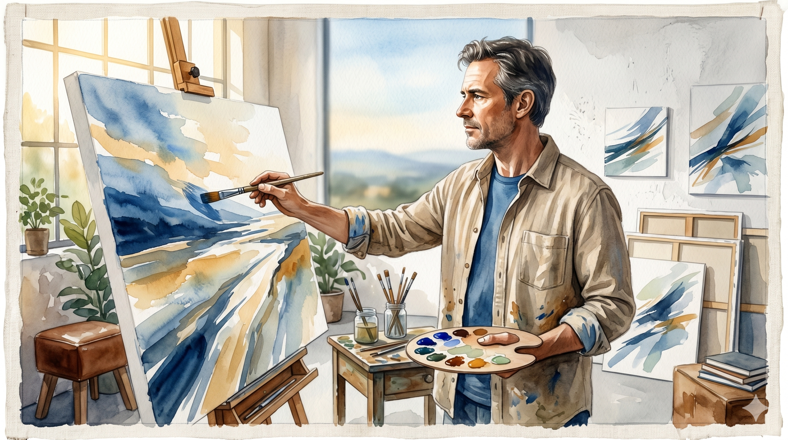
Nishikant Joshi is a known face within the artistic circles of Pune.
More than a decade of experience. A long list of successfully delivered art projects. And among them, something most artists will never come close to: he was part of the team that set the Guinness World Record for the largest book sculpture in the world.
When he came to The Marketing Mingle, the ask was practical. He wanted consistent colours across everything, his website, his flyers, his presentations. A unified visual identity that held together wherever his name appeared.
What he got was something more fundamental than that.

A Guinness Record and a Google Drive Link
Before any design work, the portfolio situation needed to be looked at honestly.
For an artist with Nishikant’s body of work, the external representation was striking in how little it reflected what he had actually built. His portfolio was a Google Drive link. A folder shared on request, with no context, no narrative, no structure that could communicate the scale or quality of the work inside it.
This was not a minor gap. When someone encounters your work for the first time, the container matters as much as the content. A Google Drive link tells a prospective client exactly what the packaging tells them: that this is not someone who has thought carefully about how they present themselves. That impression forms before a single image is opened.
He had a Guinness World Record to his name. His portfolio was a Google Drive link. The gap between those two things was the whole problem.
The brief sounded like a design job. It was not. The real problem was representation, and representation is a strategic problem before it is a visual one.
What the Discovery Actually Revealed
The first real session changed the shape of the project.
What emerged was a portrait of a person with a genuinely unusual quality: there is science and logic behind almost everything Nishikant does. His attire is deliberate. His journey has a coherent internal logic. The services he offers are rooted in a specific philosophy. Even the way he approaches a new brief reflects a structured way of thinking that most artists in his space simply do not have.
None of this was being communicated to the world.
From the outside, the impression was the opposite of what the reality was. A person with deep intellectual structure behind every decision was presenting himself in a way that suggested he was operating on instinct and goodwill alone. He was showing up with the output of his thinking, but not the thinking itself. And without the thinking, the output looked ordinary.
He had science and logic behind everything he did. The world just could not see it. He looked like a monk about to sell his Ferrari.
A person with a world record, a decade of serious project delivery, and a rigorous internal framework, looking modest. Not because the work was modest. Because the presentation had not caught up to what was actually there.

Nine Services Is Not a Menu. It Is a Problem.
The next issue was equally concrete.
Nishikant was pitching nine services. In practice, this meant that a prospective client sitting across from him had no clear sense of what he primarily did, what was central to his practice, and what was peripheral. Everything was on the table at equal weight. The effect was confusion rather than confidence.
When someone cannot quickly understand what you do best, they default to price comparison, or they do not move forward at all. A broad list of services signals availability, not expertise.
The first order of business was consolidation. Nine services became three, grouped and named in a way that reflected both what Nishikant actually does at his best and what his target clients are actually looking to commission. The reduction was not about doing less. It was about being understood faster.
The clarity that followed was immediate. Three services, each with a clear scope, a clear audience, and a clear reason to exist.
A System, Not Just Materials
Once the positioning and service architecture were in place, the collateral question could be answered properly.
Rather than producing a single portfolio or a general brochure, what was built was a funnelised system: materials matched to where a prospect is in their relationship with Nishikant.
A one-pager for every new lead. Short, specific, and designed to create curiosity rather than overwhelm. Something a person could read in two minutes and come away from with a clear sense of who Nishikant is and why they should have a conversation.
A presentation for one-on-one meetings. Structured to walk a prospect through the work and the thinking behind it in a live session, with a sequence that builds interest progressively rather than front-loading everything at once.
A full portfolio brochure for when a prospect was genuinely serious. The complete representation of the body of work, with the depth and detail that a committed buyer deserves.
Each piece of material had a job. A one-pager for new leads. A presentation for meetings. A full portfolio for serious prospects. Nothing was generic.
And the system included something most collateral projects overlook entirely: the scripts. What to say at each stage. How to open the meeting, how to move through the material, how to handle the moment when a prospect has seen the portfolio and is deciding whether to take the next step. The collateral and the conversation were designed together, because one without the other leaves too much to chance.

What Changed When It All Came Together
The brand colours were set, applied consistently across every touchpoint. The visual design was built around Nishikant’s personality as much as his work, because the person and the studio are the same thing. Nothing was generic. Nothing felt borrowed from a template.
When the full system was in place, the results followed.
More inquiries. A significantly higher rate of conversion. Prospective clients who previously might have received a Google Drive link and a vague sense of what Mad Works Studio does, now encountered a brand that communicated exactly who Nishikant is, what he does best, and why a serious commission belongs in his hands.
The work itself had not changed. The decade of experience was the same. The Guinness Record was the same. What changed was that the outside world could finally see what had always been there.
THE LESSON
The aim of this project was not to deliver collateral. It was to deliver clarity.
The collateral was the output. Clarity was the work. And clarity required consolidating nine services into three, building a system that matched materials to moments, and finding the language that let the science and logic behind Nishikant’s practice speak for itself.
An artist with a world record and a decade of serious work does not have a portfolio problem. He has a representation problem. Fix the representation, and the portfolio takes care of itself.
Mad Works Studio is now exactly what it always was. The world just finally knows it.
Read Similar Stories