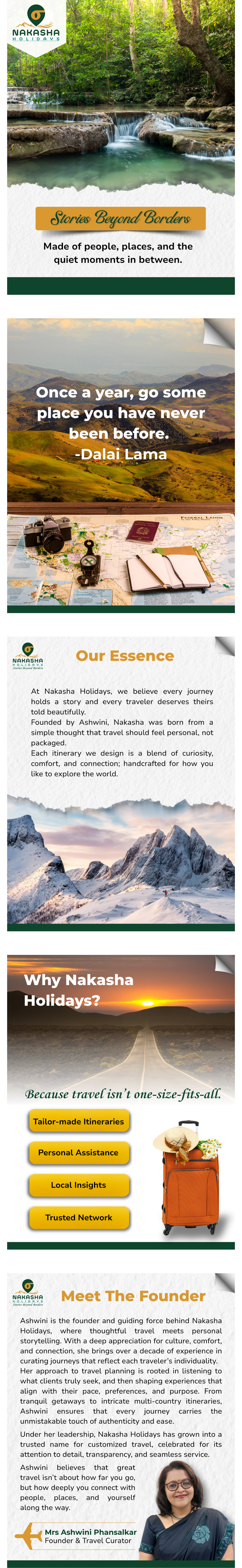
Customised journeys, thoughtfully designed for the people who take them.
A distinctive service with a generic brand.
The travel industry is one of the most visually competitive categories there is. Every operator uses the same stock photography, the same “explore the world” language, and the same colour palettes. Nakasha Holidays was offering something meaningfully different — personalised, consultative travel planning — but their brand wasn’t communicating that distinction.
To attract clients who value customisation and are willing to pay for it, the brand needed to signal premium quality and personal attention — not compete on price in a race to the bottom.
01
Blending into a commoditised market
Without a distinct identity, Nakasha Holidays looked like every other travel operator — making it impossible to justify their premium, personalised approach.
02
No visual language for "customised"
Their core differentiator — truly tailored travel — wasn't reflected in anything visual. The brand didn't feel personal, considered, or boutique.
03
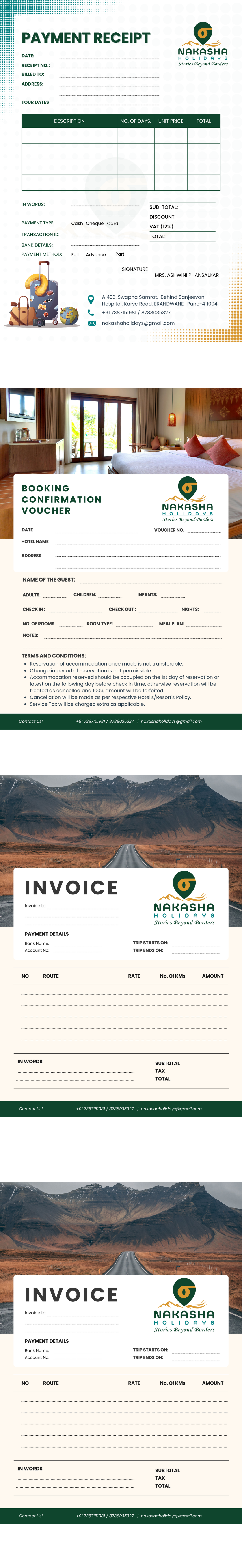
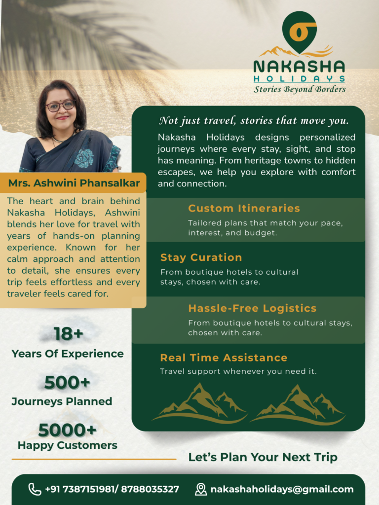
Inconsistent presentation across touchpoints
From WhatsApp to printed itineraries to social media, every format looked different — undermining the premium and attentive experience they were actually delivering.
04
No shareable, referral-ready collateral
A business built on word-of-mouth had nothing polished to share — no brochure, no itinerary template, nothing a happy client could easily pass along.
A brand built around the journey, not the destination.
We positioned Nakasha Holidays as a boutique travel consultancy — not a booking agent. The brand needed to feel considered and personal: warm but refined, adventurous but trustworthy. The visual identity was built to attract clients who make deliberate choices about how they travel.
01
Brand Positioning Brief
We defined the brand archetype — boutique curator, not mass operator — and established the audience, tone, and visual direction before any design began.
02
Logo & Visual Identity Design
Two distinct brand directions were developed: A refined logo mark was developed — evocative of movement and journey, while feeling premium and considered. Two directions were presented; the chosen one balanced warmth with sophistication.
03
Colour & Typography System
A palette built around earth tones, deep jewel accents, and warm neutrals — feeling worldly without resorting to the generic blues and teals that dominate travel branding.
04
Itinerary & Collateral Templates
A fully designed itinerary template — the most-used client-facing document in travel — alongside a brochure, business card, and social media templates, all built to the brand system.
05
Brand Guidelines Handover
A complete guidelines document covering every element of the identity — so the brand stays consistent across every format, every season, and every person who handles client communications.
For Nakasha Holidays, the brand became the first thing clients experienced — before the conversation, before the itinerary, before the booking. And that first impression now does the job of communicating exactly what kind of operator they are.


